Charthop Better UX: Improved Layout for Employee Evaluations
Charthop Better UX is a Chrome extension developed by ajatamayo. It is a free add-on tool designed specifically for Charthop.com, a webtool used to manage a company's people data, including employee evaluations. The default layout of Charthop can be challenging to navigate and use effectively.
This extension addresses this issue by injecting custom CSS to the corresponding pages, resulting in a more user-friendly experience. The changes implemented by Charthop Better UX include:
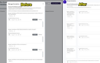
Manager Evals Popup:
- The popup window now occupies the entire screen, providing a more immersive evaluation experience.
- A report icon is displayed on the upper left corner, indicating the person being evaluated.
- The evaluation form is now organized into logical groups, improving usability.
Self Evals and Colleague Evals Results:
- Empty containers have been removed, decluttering the interface.
- The results are presented in a 2-column grid layout, enhancing readability.
- Images can be clicked to zoom in, although low-resolution images may appear pixelated.
- The issue of a pre element breaking the grid has been resolved.
- Each question and answer pair is now grouped into a card, making it easier to follow and comprehend.
The attached screenshots provide a visual representation of these changes, with sensitive information redacted. With Charthop Better UX, users can now navigate and interact with Charthop.com more efficiently, improving the overall evaluation process.